The Elegance of Typography in Design
Dipublikasikan oleh Mawar pada
The Elegance of Typography in Design
Typography is the art and technique of selecting, arranging, and composing type (fonts) in graphic design to create effective visual communication. The right typography can strengthen the message you want to convey, enhance readability, and set a specific tone for your design. In this article, we will discuss the importance of typography in graphic design, the different types of fonts, and tips for using typography effectively in your design work.
What Is Typography in Graphic Design?
Typography in graphic design refers to how text elements (letters, numbers, symbols, etc.) are arranged in a visual composition. Typography is not just about choosing a “good” font but also about understanding how that font interacts with other design elements like color, images, and layout. Proper use of typography can impact how the audience perceives the message being delivered, from formal to casual, from serious to playful.
Types of Fonts in Typography
Fonts are categorized based on the shape and style of the letters. Each category serves a different purpose and has distinct characteristics that can influence the look of your design. Here are the main font categories in typography:
Serif Fonts:
- Serif fonts have small lines or “feet” at the ends of the letters. They evoke a traditional, formal, and elegant feel.
- Examples: Times New Roman, Georgia, Garamond.
- Usage: Serif fonts are ideal for long texts such as articles, books, or printed documents because they improve readability.
Sans Serif Fonts:
- Sans serif fonts do not have extra lines at the ends of the letters. These fonts tend to be more modern, clean, and minimalist.
- Examples: Arial, Helvetica, Futura.
- Usage: Sans serif fonts are commonly used for web design, headlines, and content that requires a more modern and simple look.
Script Fonts:
- Script fonts mimic handwriting and often have curved or flowing forms.
- Examples: Brush Script, Pacifico, Lobster.
- Usage: Script fonts are suitable for designs that want to convey an elegant, creative, or personal feel, such as wedding invitations, logos, or branding designs.
Display Fonts:
- Display fonts are designed for use at large sizes and often feature unique and decorative styles. These fonts are more attention-grabbing than others.
- Examples: Impact, Bebas Neue, Playbill.
- Usage: Display fonts are typically used for large headlines, posters, or designs that aim to grab attention.
Monospace Fonts:
- Monospace fonts are fonts in which every character takes up the same amount of space. These are typically used in technical or computing contexts.
- Examples: Courier, Consolas, Monospace.
- Usage: Monospace fonts are commonly used to display computer code or in designs that require uniform formatting.
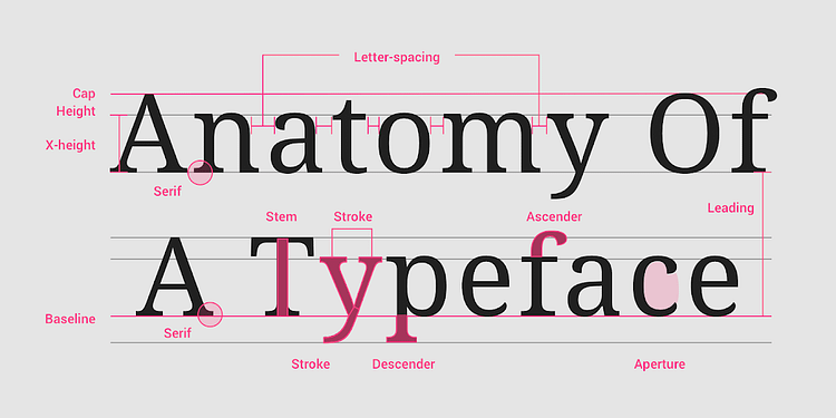
Key Elements of Typography
In addition to choosing the right font, there are several key elements of typography to consider in order to create effective designs:
Font Size:
- Font size affects readability and hierarchy within the design. Headings typically use larger font sizes to draw attention, while body text uses smaller sizes for easier reading.
Letter Spacing (Kerning):
- Letter spacing or kerning refers to the space between two specific letters. Proper kerning ensures that the text looks balanced and improves readability.
Line Spacing (Leading):
- Line spacing is the vertical distance between lines of text. The right line spacing makes the text easier to read and prevents the design from looking too cramped or too sparse.
Contrast:
- Contrast between text and background is crucial in typography. Ensure that the text stands out from the background so it is easy to read. For example, black text on a white background or white text on a dark background.
Weight and Style:
- Fonts come in various weights (e.g., bold, regular, light) and styles (e.g., italic, oblique). Using these variations can help emphasize specific parts of the text, such as headlines, subheadings, or important words.
Tips for Using Typography in Graphic Design
Keep It Simple: Using too many fonts in a single design can make it look cluttered. Limit yourself to two or three complementary fonts.
Choose Fonts That Match the Design’s Purpose: Make sure the font you choose aligns with the message and audience you are targeting. Formal fonts are best for business designs, while more creative and playful fonts may suit casual or personal designs.
Create Visual Hierarchy: Typography hierarchy is crucial to guide the audience’s attention to the most important elements. Use larger font sizes for headings and subheadings, and smaller sizes for body text.
Consider Readability: Choose fonts that are legible at different sizes, especially for longer texts. Avoid using overly decorative or complex fonts for body text, as they can make reading uncomfortable.
Embrace White Space: Adequate white space around text helps improve readability and gives your design a cleaner, more organized appearance.
Common Typography Mistakes to Avoid
Using Too Many Fonts: Using too many different fonts can make your design look disorganized and unprofessional. Stick to a maximum of two or three fonts in a single design.
Choosing the Wrong Font: Using a font that doesn’t match the context or target audience can distort the message. Always choose a font that complements your design’s purpose and brand.
Messy Letter Spacing: Poor kerning or letter spacing can affect the legibility of your text. Make sure to adjust spacing properly for a balanced look.
Lack of Text Contrast: Ensure that your text contrasts sufficiently with the background. Text with insufficient contrast is difficult to read and can make your design look unprofessional.
Conclusion
Typography is a crucial element in graphic design that significantly impacts how your message is perceived by your audience. By selecting the right fonts, adjusting font size, spacing, and contrast, and creating a clear visual hierarchy, you can produce designs that are not only visually appealing but also effective in communication. Paying attention to the details of typography will elevate your graphic design work and help convey your message in a clear and professional manner.
0 Komentar