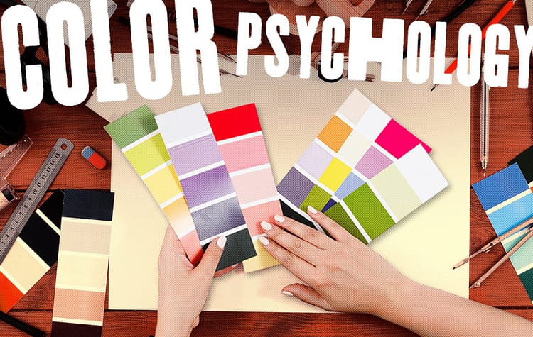
The Psychology of Color in Design
Dipublikasikan oleh Mawar pada
The Psychology of Color in Design
Color is a fundamental element of graphic design with the power to influence emotions, establish identity, and convey messages visually. Understanding color theory and using colors effectively are essential for creating impactful and meaningful designs.
Understanding Color in Graphic Design
In graphic design, color is a visual element formed from the spectrum of light. It serves various purposes, such as:
Capturing the audience’s attention.
Building brand identity.
Creating specific emotions or atmospheres.
Directing focus to essential elements in the design.
Color Theory: The Basics You Need to Know
Color theory is the study of how colors interact and how different combinations can create harmony or contrast. Key concepts include:
1. Color Wheel:
The color wheel is a visual tool to understand relationships between colors.
Primary Colors: Red, blue, yellow.
Secondary Colors: Green, orange, purple (formed by mixing primary colors).
Tertiary Colors: A mix of primary and secondary colors.
2. Types of Color Combinations:
Monochromatic: One color with different shades and tints.
Analogous: Colors next to each other on the color wheel (e.g., blue, blue-green, green).
Complementary: Colors opposite each other on the wheel (e.g., red and green).
Triadic: Three colors evenly spaced on the wheel (e.g., red, yellow, blue).
Tetradic: Two pairs of complementary colors.
Color Psychology in Graphic Design
Color psychology studies how colors influence emotions and behavior. In graphic design, it is often used to create specific impressions or moods.
Red: Energy, passion, and boldness. Perfect for promotions or dynamic designs.
Yellow: Happiness, optimism, and attention-grabbing. Creates a cheerful atmosphere.
Blue: Trust, professionalism, and calmness. Ideal for corporate designs.
Green: Nature, freshness, and balance. Works well for eco-friendly or health-related brands.
Purple: Luxury, creativity, and imagination.
Orange: Enthusiasm, energy, and innovation.
Black: Power, elegance, and mystery.
White: Simplicity, purity, and minimalism.
Color Models in Graphic Design
Color models define how colors are represented digitally and in print.
1. RGB (Red, Green, Blue):
Used for digital designs like websites and apps.
Colors are created by combining light in red, green, and blue.
Tip: Test designs on different devices to ensure consistency.
2. CMYK (Cyan, Magenta, Yellow, Black):
Used for printed materials.
Colors are formed by mixing cyan, magenta, yellow, and black inks.
Tip: Always design in CMYK mode for print projects.
3. HEX (Hexadecimal):
A color code system used for web design.
Examples: #FFFFFF (white), #000000 (black).
Principles of Using Color in Graphic Design
Consistency: Use a cohesive color palette to reinforce visual identity.
Contrast: Ensure key elements, such as text, stand out against the background for readability.
Visual Hierarchy: Use color to draw attention to the most important elements in your design.
Harmony: Select harmonious color combinations to create visually pleasing designs.
Message Alignment: Ensure the chosen colors align with the intended message or mood.
Common Mistakes in Color Usage
Using Too Many Colors:
Overloading a design with multiple colors can look chaotic. Stick to 3–5 main colors for harmony.
Poor Contrast:
Low contrast can make designs hard to read or dull.
Ignoring Color Psychology:
Choosing colors that don’t match the message can confuse the audience.
Not Testing Colors:
Always test designs on different devices or print materials to ensure accurate color representation.
Conclusion
Color is a powerful tool in graphic design. By understanding color theory, psychology, and usage principles, designers can create visually striking and meaningful designs. Continue experimenting and exploring new color combinations to refine your skills and elevate your designs.

0 Komentar