Design Secrets: Mastering Balance and Harmony
Dipublikasikan oleh Mawar pada
Design Secrets: Mastering Balance and Harmony
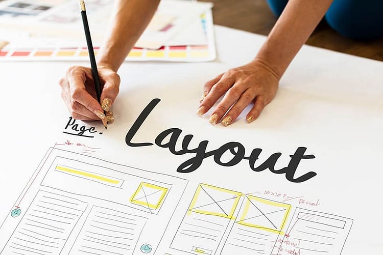
Layout and composition are the backbone of effective graphic design, determining how visual elements are arranged to create captivating, harmonious, and easy-to-understand designs. In this article, we’ll explore the fundamental concepts, key principles, and practical tips for crafting outstanding layouts and compositions.
What Are Layout and Composition?
- Layout: The arrangement of design elements like text, images, and graphics within a workspace (canvas). A good layout ensures these elements are organized, functional, and visually appealing.
- Composition: The way visual elements are arranged to create balance, hierarchy, and a pleasing flow for the audience. Composition is crucial for effectively conveying your message.
Core Principles of Layout and Composition
Balance:
- Ensures that the design doesn’t feel visually “heavy” on one side.
- Types of balance:
- Symmetrical: Elements are evenly distributed on both sides.
- Asymmetrical: Uneven elements achieve balance through size, color, or texture.
Visual Hierarchy:
- Guides the viewer’s attention to the most important parts of the design.
- Use size, color, and positioning to highlight key elements, such as headlines or main images.
Alignment:
- Aligning elements creates order and a professional appearance.
Contrast:
- Contrast helps differentiate elements and adds visual interest. Use light and dark colors, or large and small text, for contrast.
Repetition:
- Repeating elements like colors, patterns, or shapes creates consistency and reinforces the design’s visual identity.
White Space:
- The empty areas surrounding elements in your design. White space makes key elements stand out and keeps the design clean.
Proportion:
- Refers to the size relationships between elements. Larger elements naturally draw more attention.
Tips for Creating Effective Layouts
Use Grids or Columns:
- Grids help organize elements consistently and maintain balance. Many design tools like Adobe InDesign and Figma include grid features.
Understand Your Purpose:
- Before designing, identify the message you want to convey and the target audience.
Choose the Right Typography:
- Use fonts that are legible and match the theme of your design. Stick to two or three fonts to avoid clutter.
Pay Attention to Scale:
- Ensure that key elements, like headlines or images, are large enough to grab attention.
Select Colors Wisely:
- Use a cohesive color palette that aligns with the theme and purpose of your design. Add contrast to emphasize specific elements.
Create a Focal Point:
- Make sure your design has one dominant feature, such as a bold headline or a striking image, to immediately catch the viewer’s eye.
Test Your Design:
- View your design as an audience would. Does it effectively convey the message? Is it visually appealing and easy to understand?
Examples of Layout Applications in Graphic Design
Magazine or Poster Layouts:
- Use grids to organize text and images. Place the headline at the top in a large font, followed by supporting visuals.
Website Layouts:
- Prioritize visual hierarchy for navigation. Highlight interactive elements like call-to-action (CTA) buttons.
Social Media Layouts:
- Create attention-grabbing designs with bold elements, high contrast, and instantly visible messages.
Common Mistakes in Layout and Composition
Overcrowded Designs:
- Avoid cramming too many elements into one design. Incorporate white space for balance and clarity.
Weak Visual Hierarchy:
- If key elements don’t stand out, the design’s message may be lost.
Poor Color Choices:
- Clashing colors can make a design look unprofessional. Use color theory to create harmonious palettes.
Unreadable Typography:
- Text that’s too small or lacks contrast with the background can frustrate readers.
Conclusion
Layout and composition form the foundation of impactful graphic design. By mastering principles like balance, visual hierarchy, and the effective use of white space, you can create designs that are not only visually appealing but also convey messages clearly. Continue experimenting and refining your skills to craft compelling designs that resonate with your audience.

0 Komentar